Why Responsive eLearning is Moment of the Need?
In this technology-driven world, we switch multiple devices in a day to accomplish our tasks, be it working or learning. If we start reading a blog on an iPad, we’ll probably end up on a desktop. As we are constantly on the move and multi-tasking, we need flexibility to look up the information at the moment of need. So it makes complete sense to deliver eLearning that works on multiple devices. And responsive eLearning is here to help you and is the future of eLearning.
Let’s briefly discuss what, why and how of Responsive eLearning.
What is Responsive eLearning Design?
“Responsive eLearning (adapted from responsive web design) is dynamic eLearning content that adapts intuitively to fit varying screen sizes and devices/platforms.” Simply put, it is the eLearning that adapts and responds to all devices.
Responsive eLearning design when developed with HTML5 provides multi-device compatibility which means you can access eLearning anywhere, anytime and on any device. With this design, the learners can pinch, scroll or zoom the eLearning content and easily navigate while the instructional content is optimized across the devices providing a better learning experience. Thus, it makes learning convenient and user-friendly for the learners who are constantly multitasking and/or on the move.
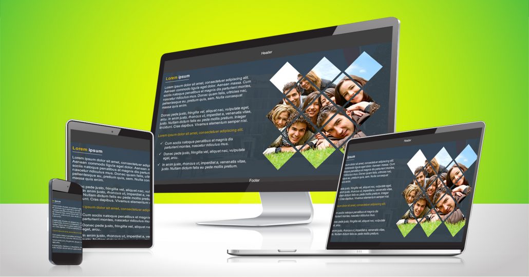
Here’s how the layout, image, and content is adjusted based on devices.
Why Responsive eLearning Design is a Must-Have for Online Training Content?
The adaptive design capabilities of authoring tools are limited. And designing eLearning to suit each device separately can be expensive and tedious – Traditional method. But using responsive framework, just a single version of eLearning course is enough as it can be viewed on multiple devices which is quite cost-effective. Due to this flexibility, HTML5 responsive eLearning provides the best learning experience possible. It also appeals to the learning psychology of present generation where the attention span tends to be low.
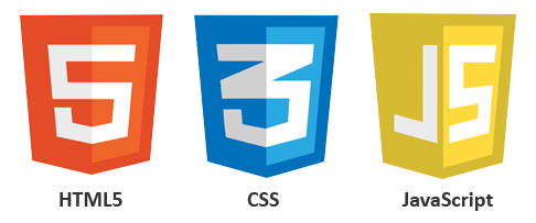
Technologies Required:
Designing a great responsive eLearning requires a thorough understanding of the key technologies and ingredients that realign, resize and reshape the content and layout to fit different screens.
Key technologies:
Key components (of CSS):


Responsive learning is future and is here to stay. Your millennial workforce may need to access the eLearning courses on various devices. So it’s time to think beyond traditional eLearning and consider the responsive framework to future-proof your eLearning, keeping learner’s preferences in mind.
Our Services: Flash to HTML5 Conversion Services, eLearning Solutions, Custom eLearning Content Development
Leave a Reply
Want to join the discussion?Feel free to contribute!