Responsive eLearning Courses Using Fluid box Feature – Adobe Captivate 2019
- How to utilize fluid Boxes to create responsive eLearning courses
- How to modify the properties like flow, wrap, and alignment
- Secure the positioning of the objects on the screen
- Convert fluid boxes to static fluid boxes
- Mark, the decorative or less important objects as optional to make them disappear from the smaller device
Build Responsive courses with Captivate 2019 Fluid Boxes
Step 1:
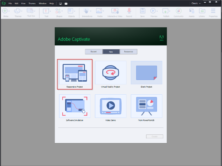
Select Responsive project from the list.
Step 2:
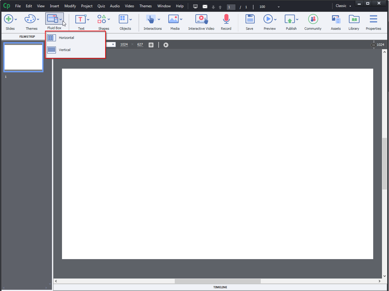
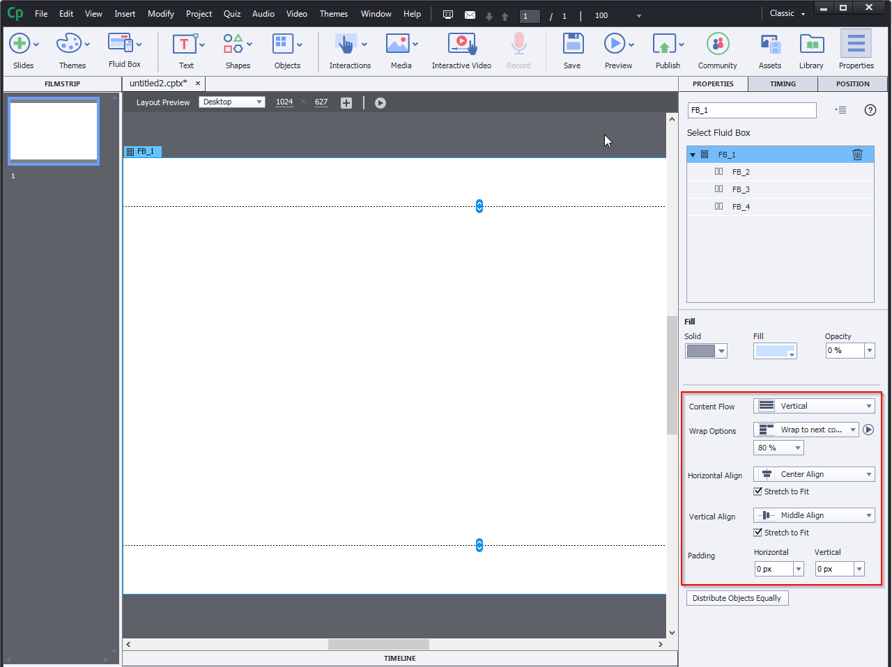
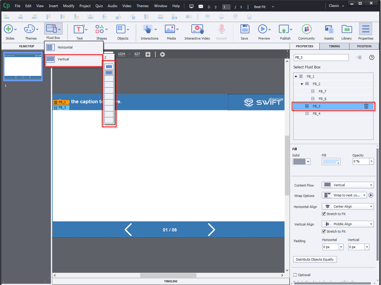
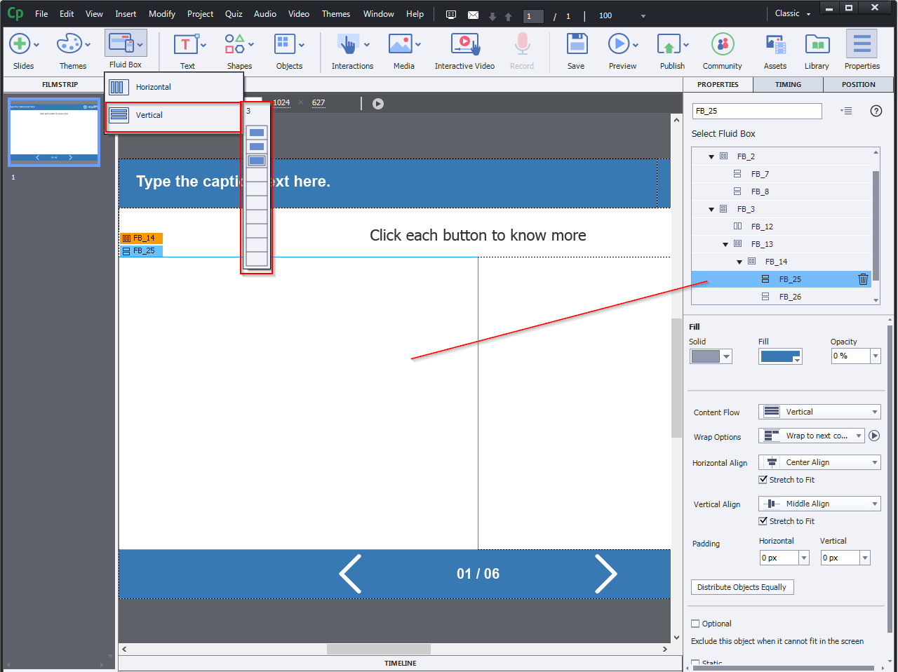
Flow: The Flow property of Fluid Boxes determines the direction of content flow inside the selected Fluid Box. On the Captivate toolbar, go to Fluid Boxes, and based on your screen layout requirements, you can choose between Horizontal or Vertical flow.
Step 3:
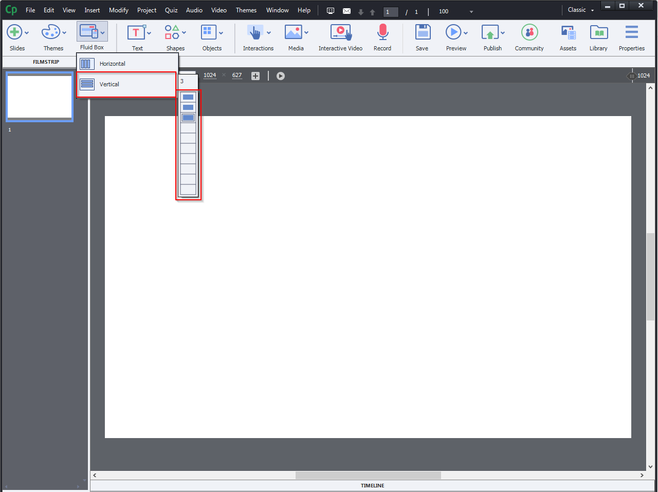
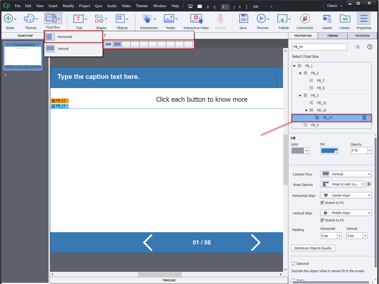
Let’s select vertical in this example and after that horizontally three Fluid Boxes from the drop-down list.
Step 4:
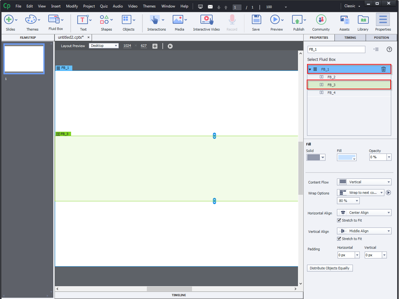
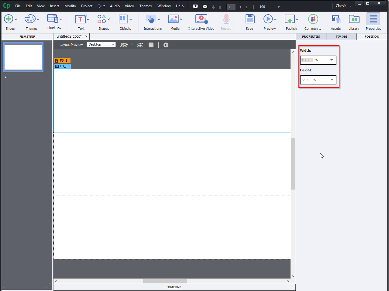
Select the Fluid Box for which you want to change the size.
Step 5:
Select percentage or pixel from the drop-down menu, and then enter the value in the input boxes.
Step 6:
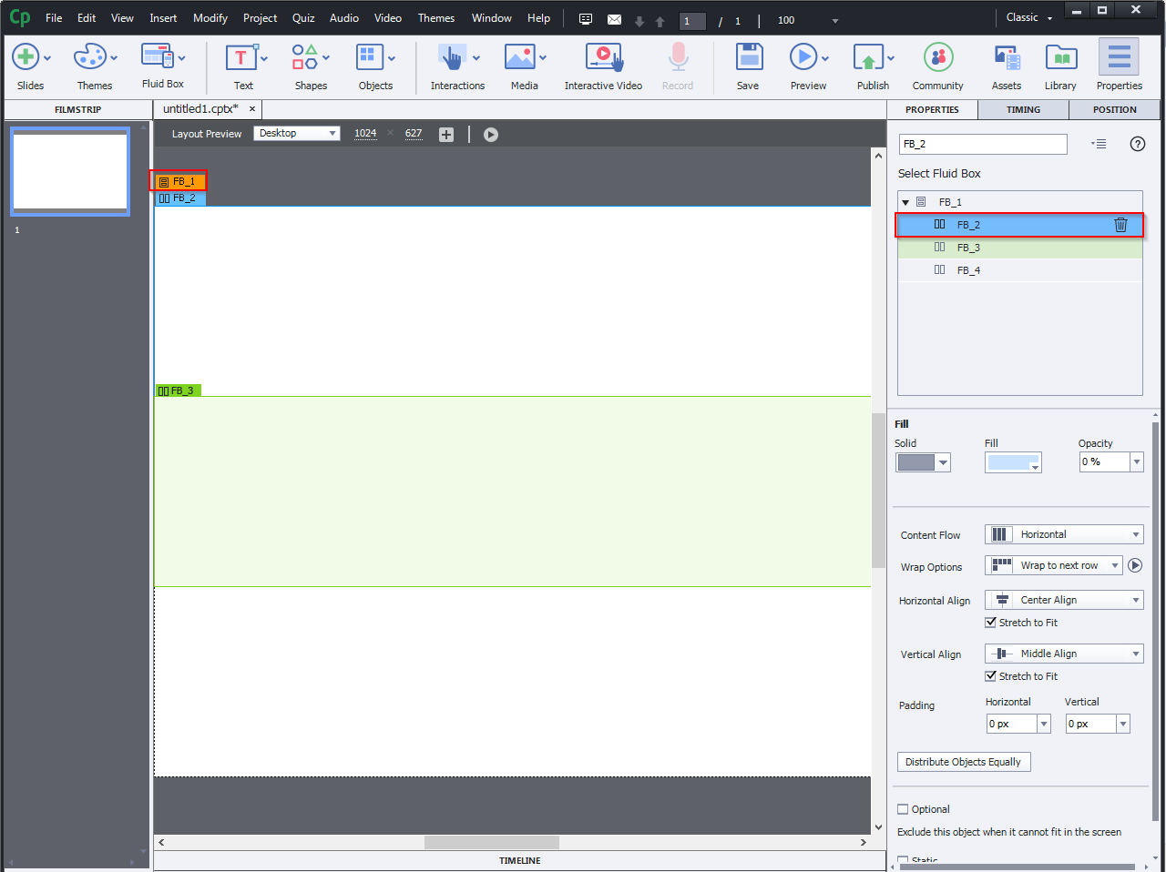
The parent Fluid Box label appears in orange just above the child Fluid Box label in the selected Fluid Box. Click the Orange label to pick the parent Fluid Package. A green highlight, outline, and mark appear when you mouse over another Fluid Package.
Step 7:
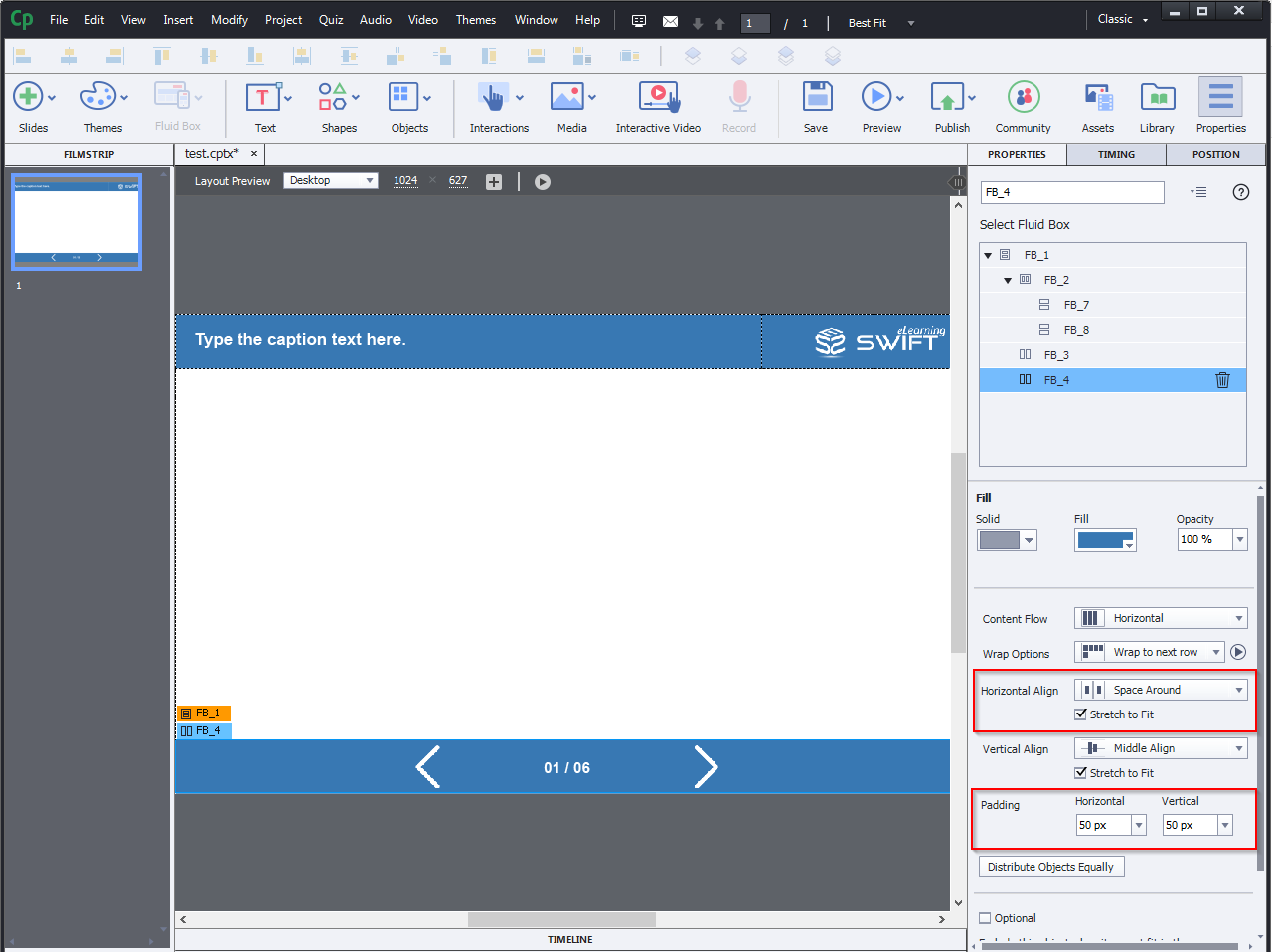
Select the Fluid Box and then decide the horizontal and vertical alignment property as required.
Step 8:
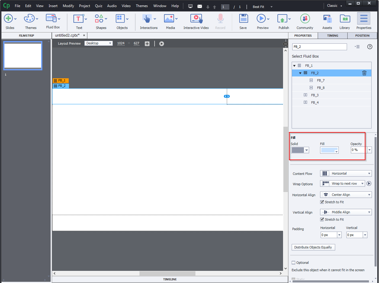
In the Fill selection panel, add the values as required.
Step 9:
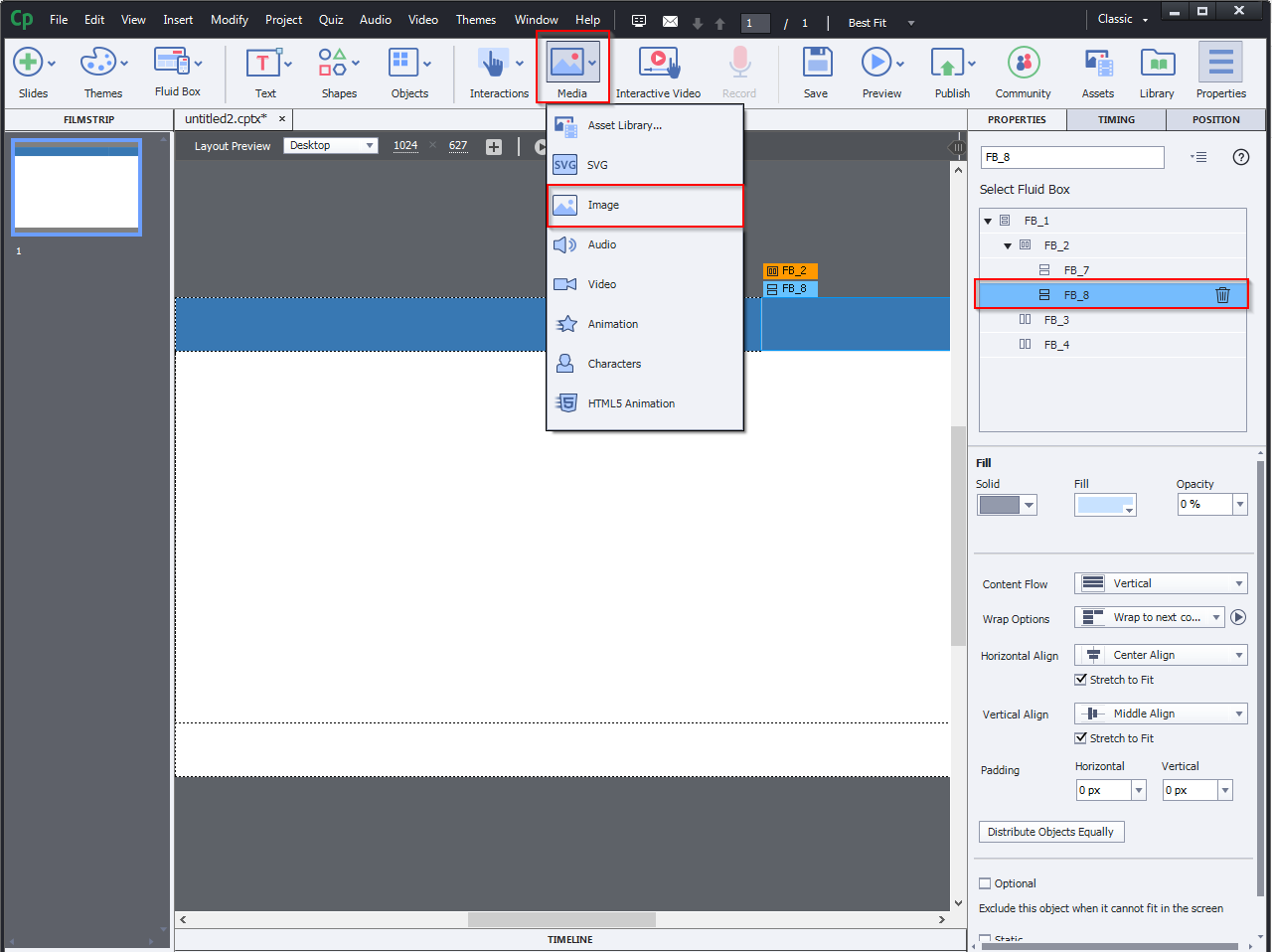
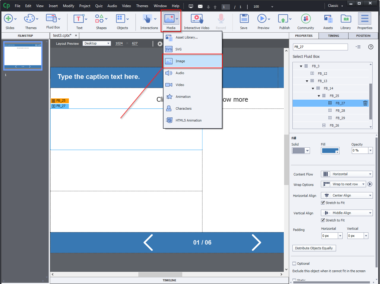
You can also insert pictures and logos by choosing Media from the toolbar.
Step 10:
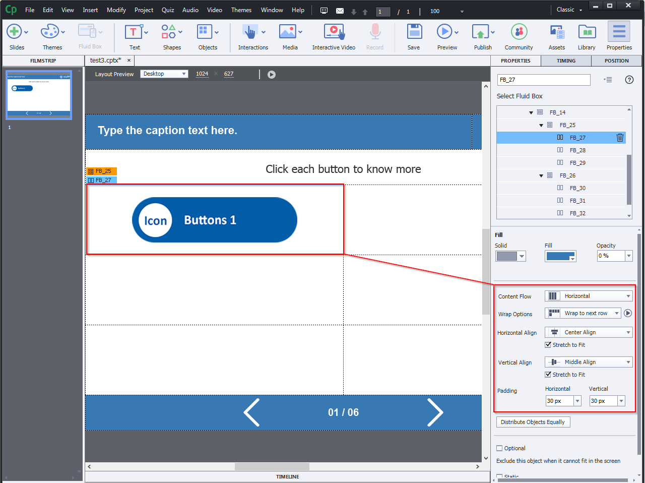
You can see navigations and page numbers in the bottom fluid box and the properties are highlighted in the right-side panel.
Step 11:
Now you can add fluid boxes to the working area as you required.
Step 12:
Insert an image from the media.
Step 13:
In the previous edition, the default fluid box orientation for smaller devices was center and middle. Instead of using default alignment, you can specify the alignment of the fluid boxes in this version.
Step 14:
How to modify the properties like flow and wrap:
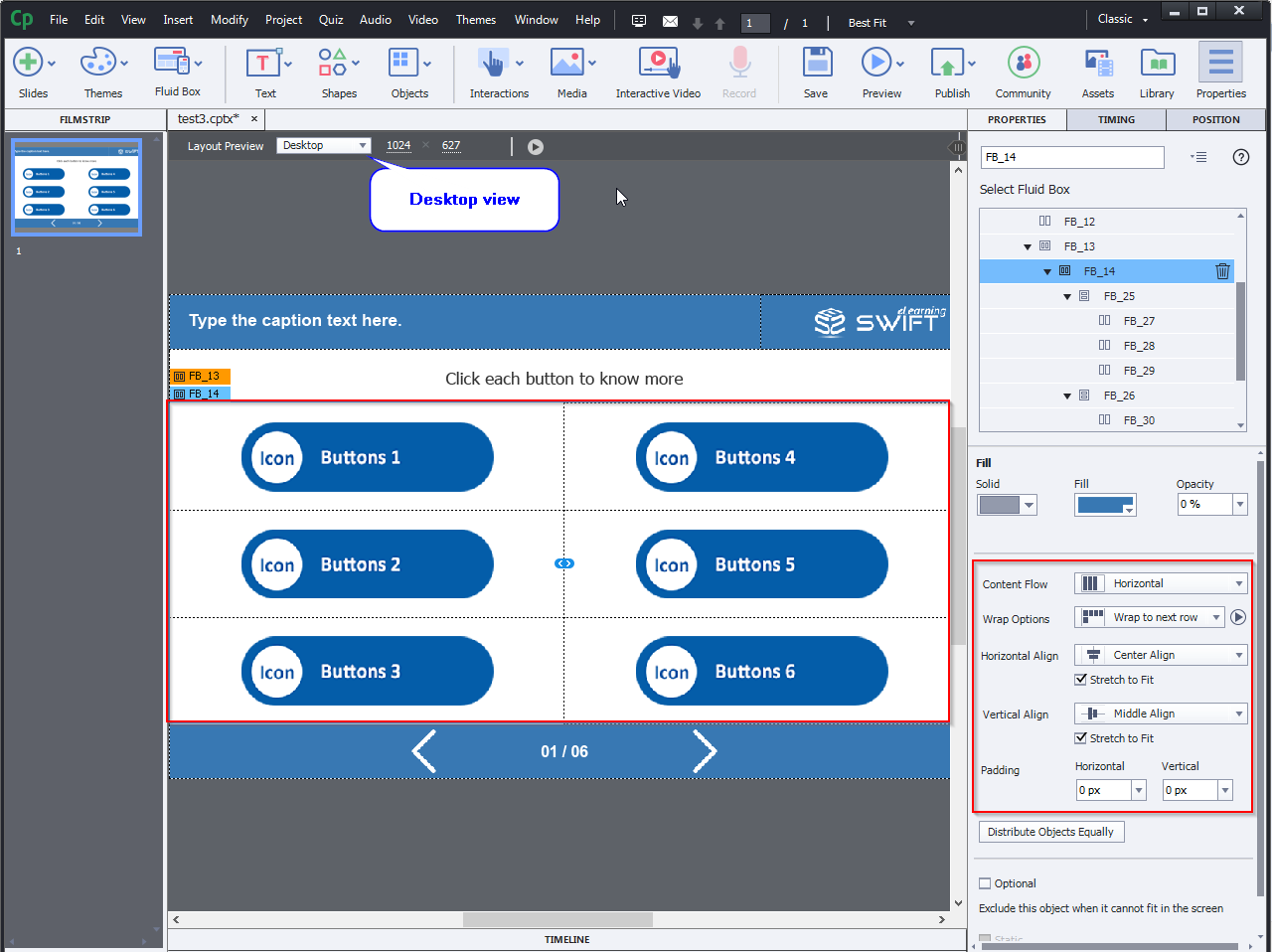
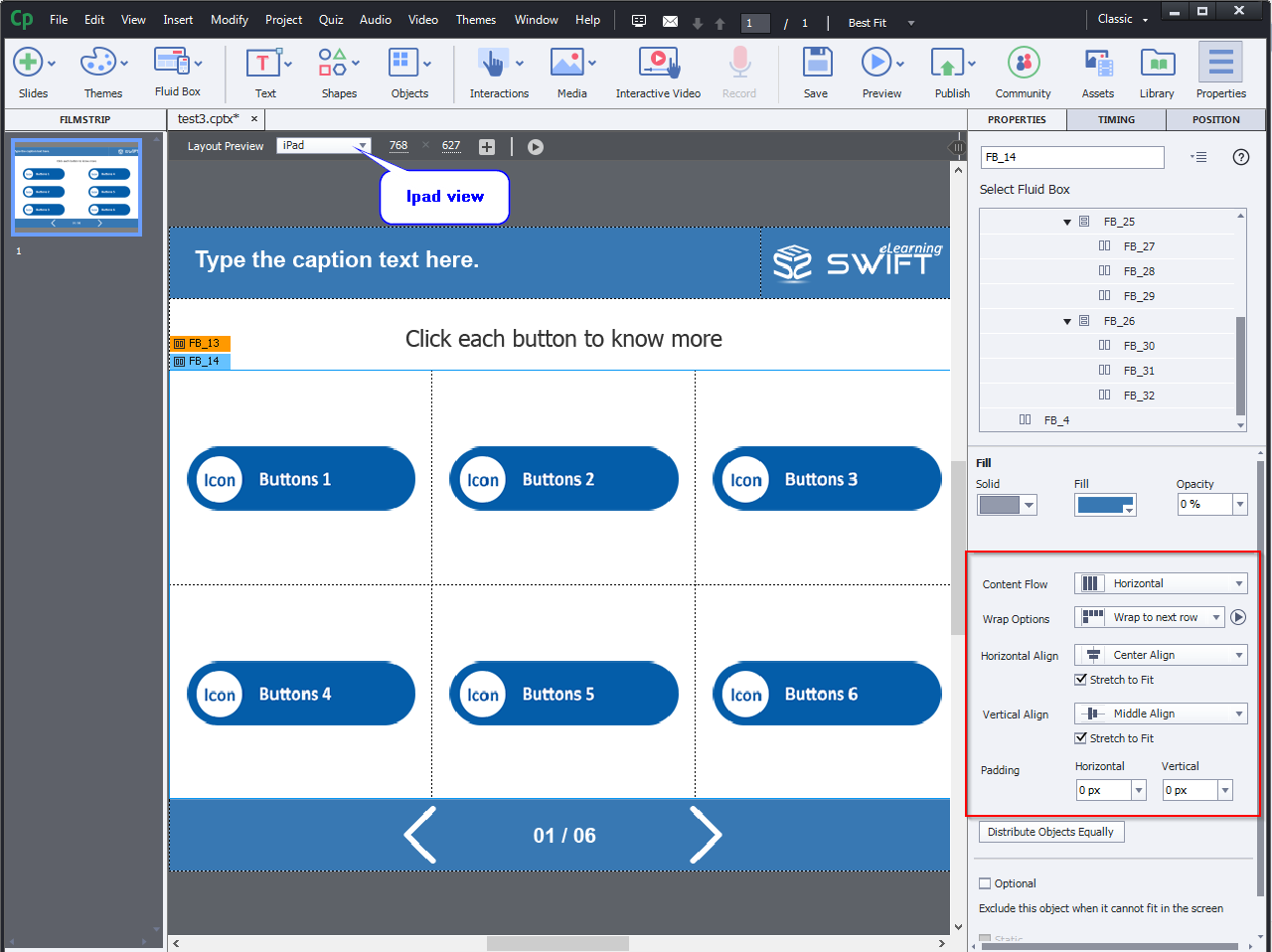
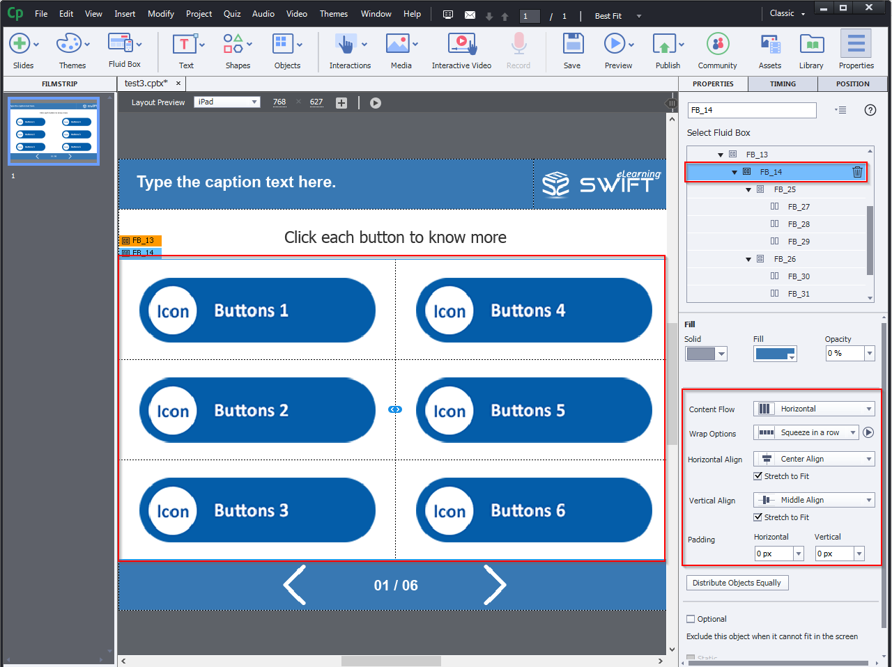
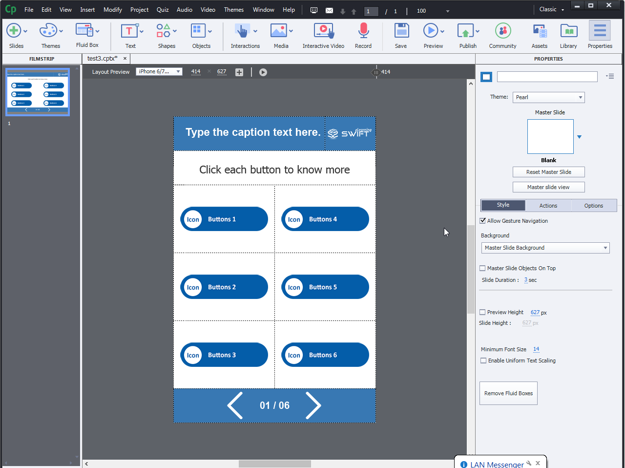
The Desktop view and the iPad view have the same assets, but the structure varies when switching to the iPad.
Step 15:
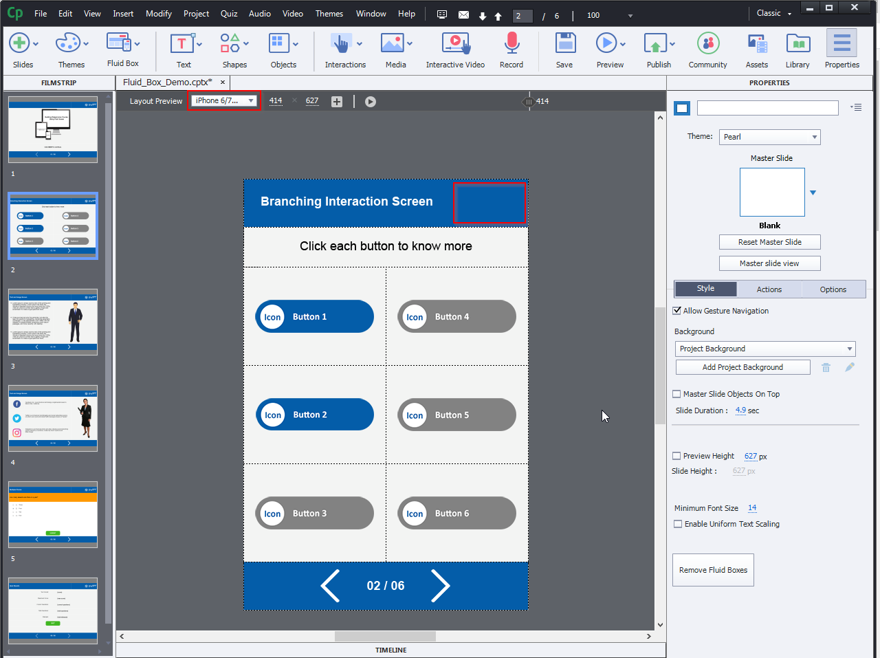
Here are the layouts after modifying the properties values in iPad and Mobile device view.
Step 16:
Wrap:
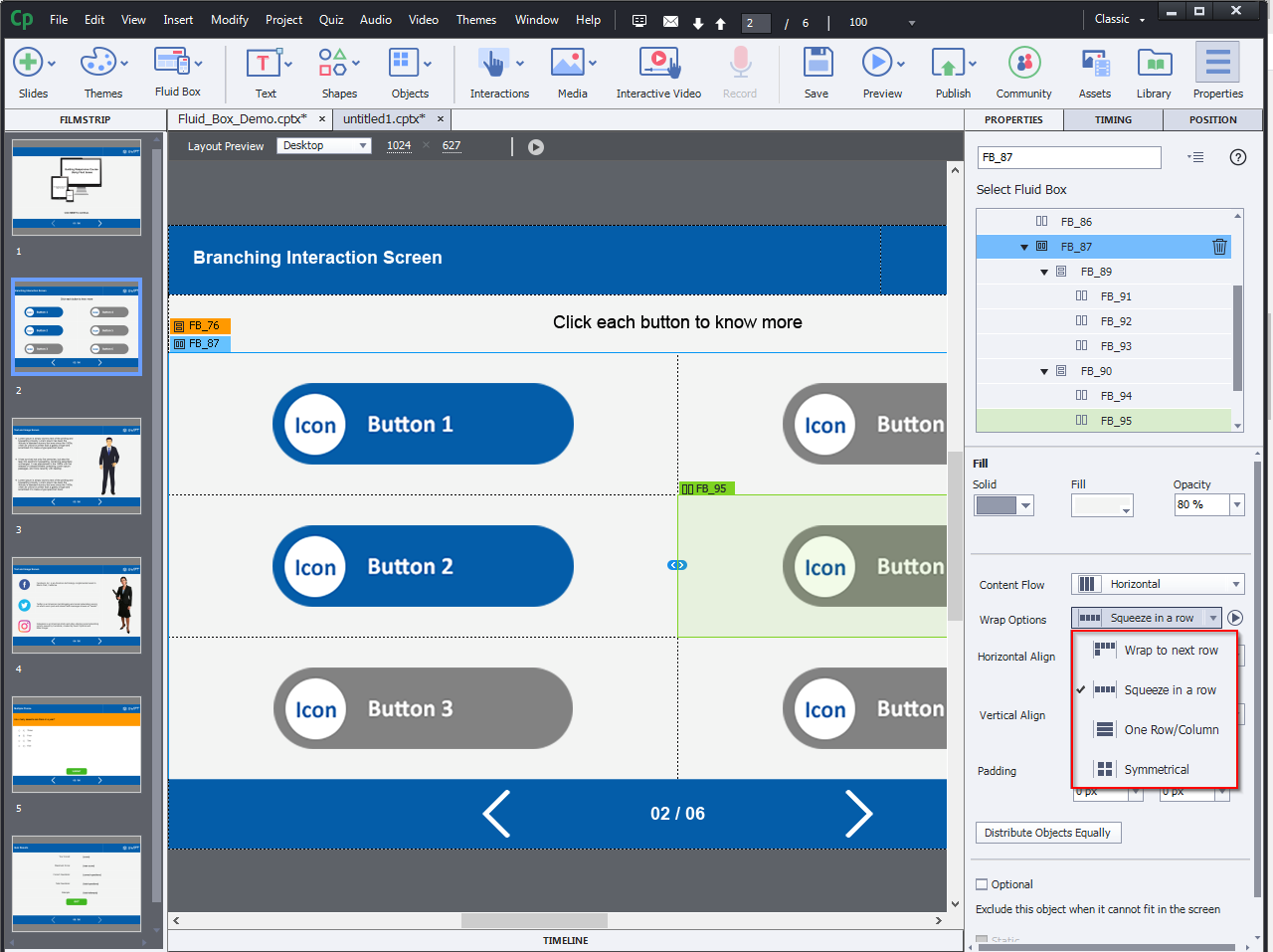
The most important aspect of Fluid Boxes is wrapped. On smaller devices, it controls when and how the objects wrap to the next row.
Wrap to next row: Whenever the wrap point reaches its maximum and can no longer keep any of the objects in the same row, the last object in the Fluid Box is moved to the next row. This movement occurs in a proper sequence, with the objects being moved one-by-one to the next row.
Squeeze in a row: This choice is useful if you want the objects to remain in the same row instead of moving them to the next row.
One Row/Column: The whole property compacts the objects into a single row or column. When the wrap point exceeds the mark, the objects are vertically aligned instead of horizontally.
Symmetrical: Instead of moving one object at a time, this feature moves a group of objects to the next row, keeping an equal number of objects in each row.
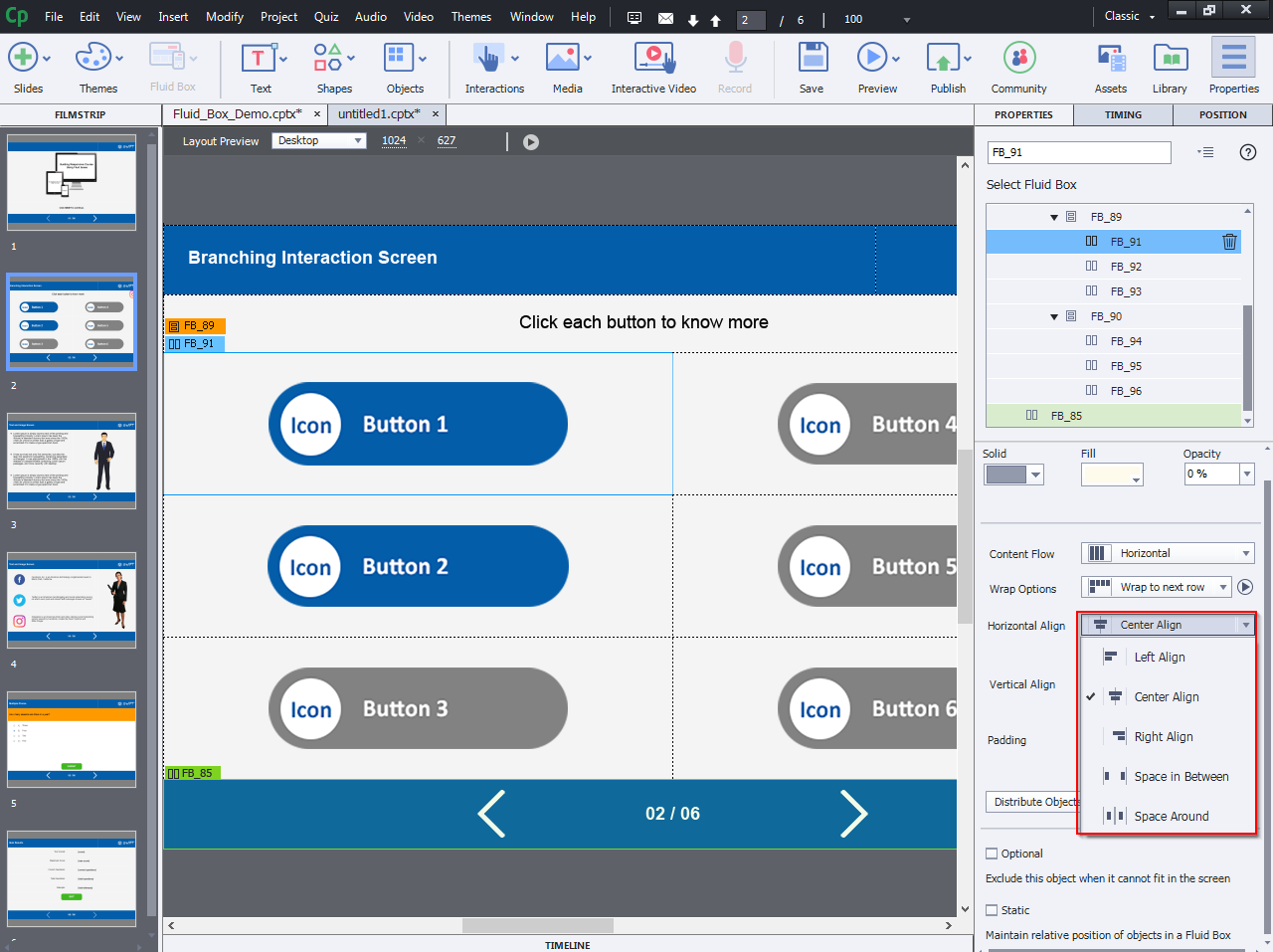
Alignments: You can use this property to monitor how the objects in the Fluid Boxes are aligned. Uncheck the “Stretch to Match” choices for both Horizontal and Vertical alignment properties to see the alignment settings.
Horizontal alignment:
Left: Left-align the objects in the Fluid Box.
Right: Right-align the objects.
Center: Center-align the objects.
Space in between This property allows the objects to be evenly distributed inside the Fluid Box.
Space around: The objects are evenly distributed in the Fluid Box with equal space around the objects.
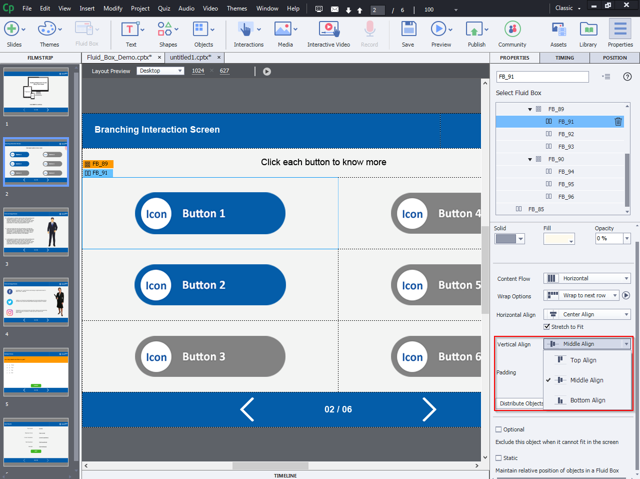
Vertical alignment:
Top: Top-align the objects in the Fluid Box.
Bottom: Bottom-align the objects.
Middle: Middle-align the objects.
Step 17:
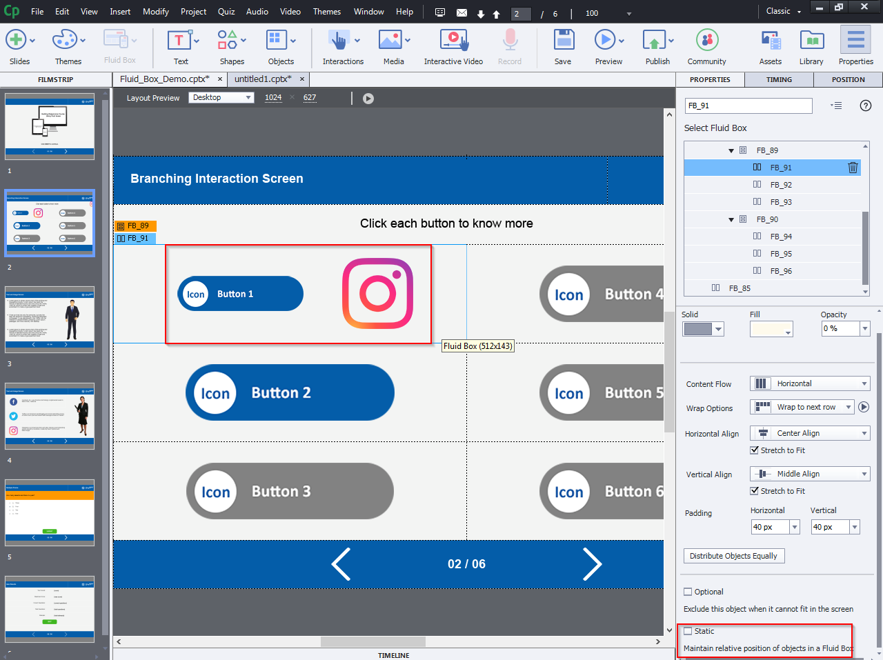
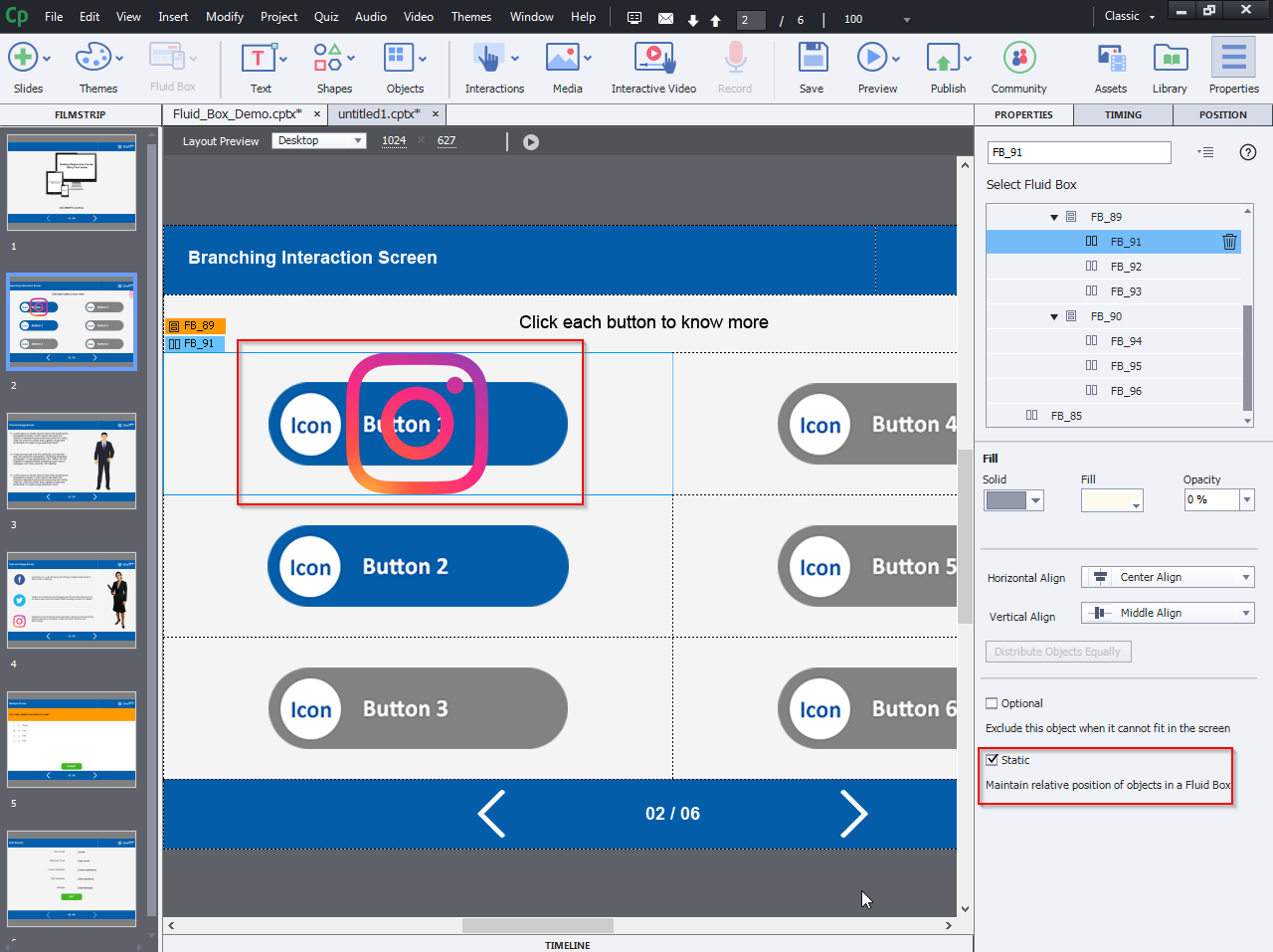
Static Fluid Boxes:
If you want to put overlay objects within a Fluid Box, you can convert it to a Static Fluid Box. Instead of putting the objects side-by-side, you can position them on top of each other, or completely overlapped on each other by using this property.
Step 18:
Optional Fluid Boxes:
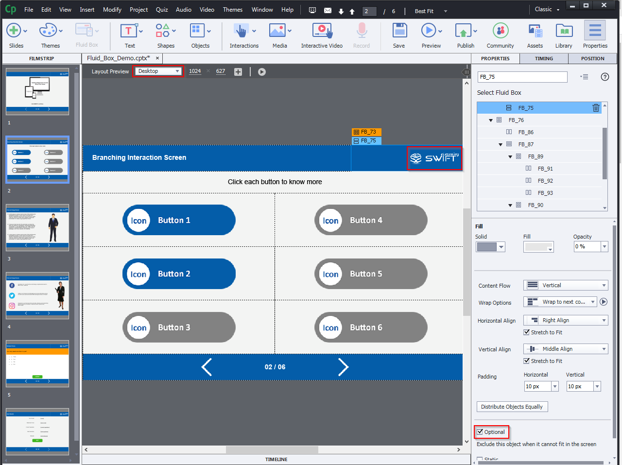
If you’re going to squeeze a couple of items into a row or column, label the less important ones as optional, and they’ll disappear on smaller screens.
Click here to view a sample responsive eLearning course.

